I had a revelation a few months ago: After years of writing and doubt, I wasn’t going to send a single solitary inquiry to a publisher or literary agent. I was going to Self Publish!
You’d think I’d never heard of such a thing. But, in truth, self-pub has been a dirty word in publishing for a long time. Who would be the gatekeepers of quality?
Well, you know what? Who was the hero behind “Miles to Go”, the story of a teenage Miley Cirus? Or even Stephen King’s “Under the Dome” (one of the POV characters is a freaking bird).
If the gatekeepers have decided that this is the definition of “quality”, then I’m going to be my own gatekeeper.
Sure, there are a tonne of bad writers out there; people who don’t get their manuscripts professionally edited, nor have a decent cover designed. But who cares? Who’s to say their dream isn’t valid enough to see the light of day?
As a reader, the beauty of Kindle is that you can review a book’s first pages. If it reads like crap, don’t buy it. If you bought and hate it, chances are you only spent a couple of bucks on an ebook. I’ve spent $32 on a paperback (typical Australian book prices) that was published by a much lauded international publisher, and I couldn’t get past the first few chapters.
Nobody owns taste.
With a manuscript being prepared by an editor, I decided to publish a collection of short stories, so I could get used to the process before embarking on a bigger project. Kindle Publishing made the job pretty straightforward, as did some credits over at Fotolia for a high res (legal) image, and an account at ODesk to hire a designer to work on the cover
Odesk is a fantastic resource if you’re not a designer and are time poor. You can post a job and wade through applications before you hire a suitable candidate. It can be hit and miss and you may find yourself hiring a few people before you see the option you prefer, but it’s a fun process.
Key to everything (especially with Odesk) is knowing what you want. I started with a brief and a couple of photos that I wanted to use on the cover.
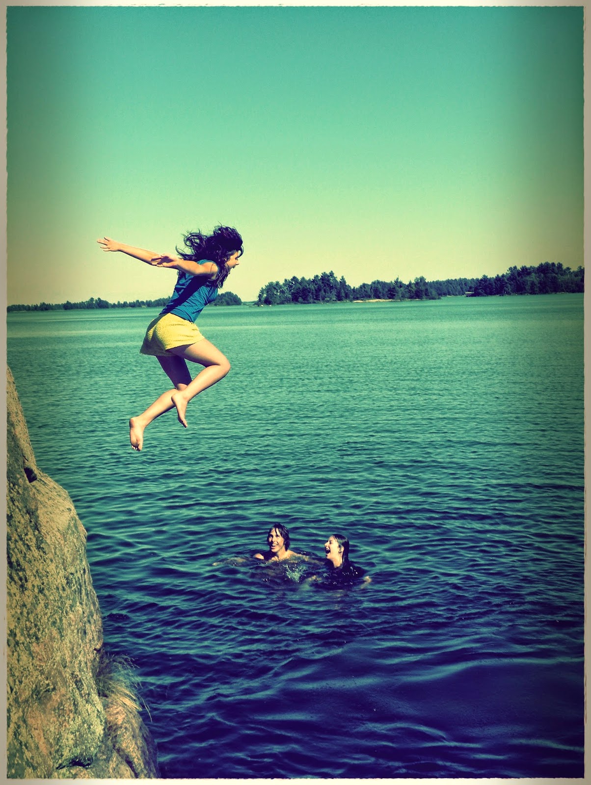
I showed a few friends some of the options, just to gauge which of the two photos they preferred and, there was an outright winner based on what they knew of my stories.
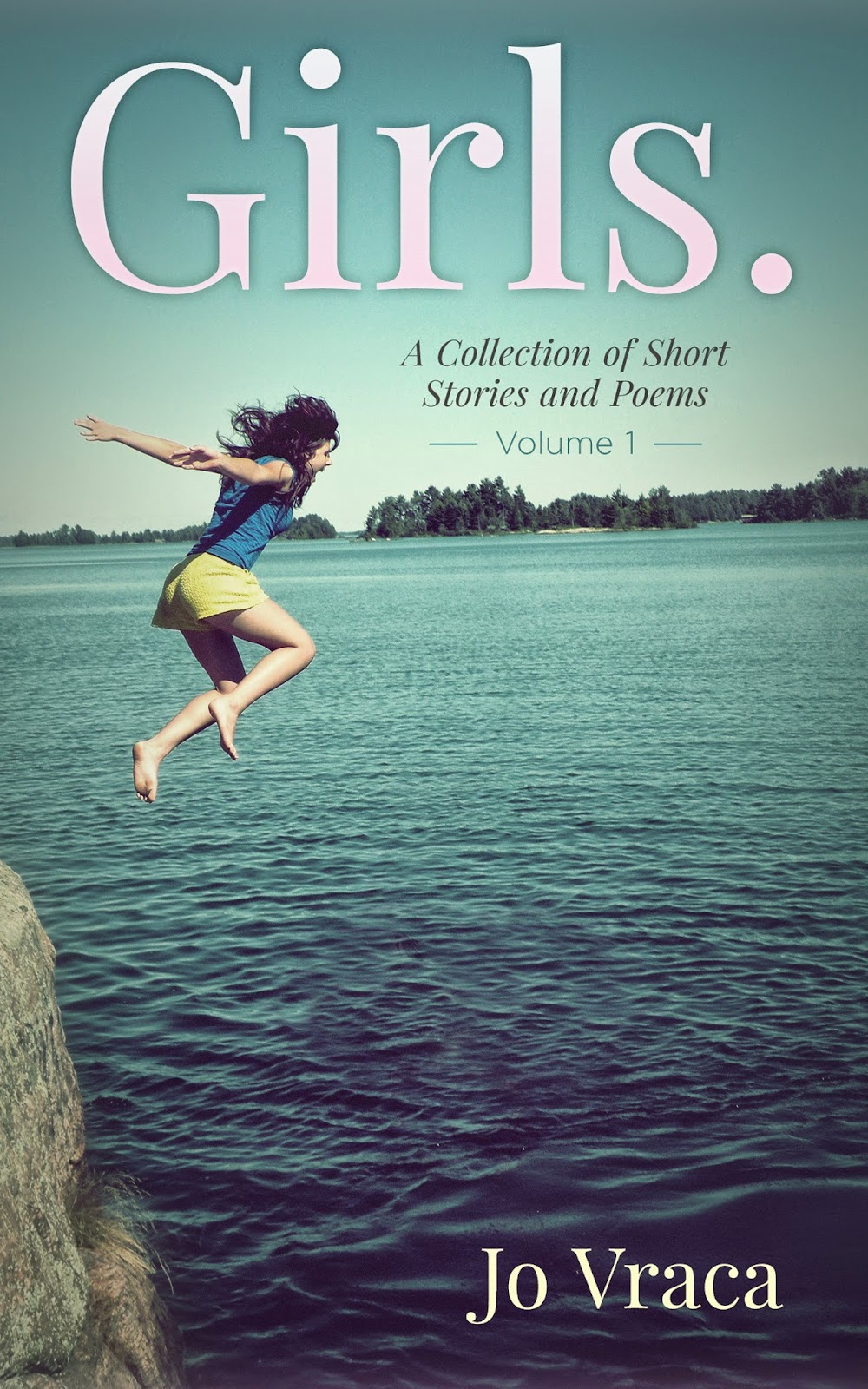
I ended up hiring three designers to work on the cover because I wasn’t happy with a few of the design directions. But, in the end, I was pretty pleased with the simple outcome. Below are a few of the drafts (and my comments), and the winner!
.jpg) |
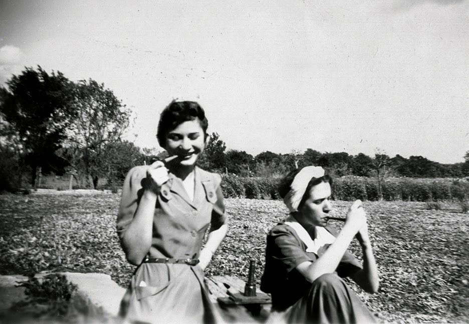
| The yellow text of Option A didn’t work for me (too sickly) but I loved the literary feel of option B. Plus, I was clear in my brief that pink was to be used in the title. However, the preferred image was of the girl jumping in the water, so I ditched the vintage black and white pic, even though I loved it!) |
.jpg) |
| A different designer. Hard to explain what I didn’t like about this. Just everything – the title font, the pink that was used (my idea, but it really didn’t work!) And I hated the people in the water. |
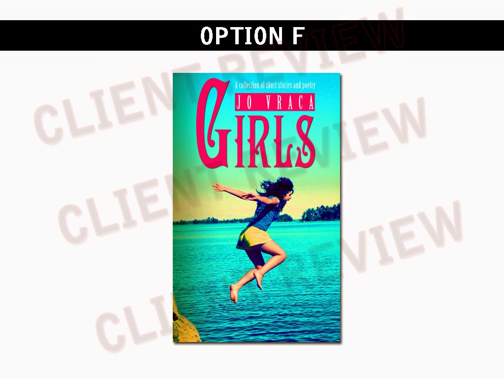 |
| Talk about missing the point in my brief. I asked for the swimmers in the water to be obscured and the colours to be brightened up and made a little vintage. Lesson learned here was that you have to be VERY SPECIFIC about what you want. I have no idea where the gothic font came from… |
And this is what I ended up with. Simple. Subtle. Not perfect. But it works. The designer understood what I meant by “pink”!
Comments are closed.